“Do not try to paint the grandiose thing …”
William Merritt Chase: Gilded Age Rebel, Aesthete, Dandy, Conservative.
Retrospective at the Museum of Fine Arts, Boston

1. Ready for the Ride. Oil on canvas. 1877. Museum of Fine Art, Boston. (All illustrations in this post are of works in exhibit and can be enlarged by clicking.)
On March 1898 a New York Times writer mused about the nature of artistic cycles.1 The immediate subject was the opening of the Society of American Artists’ annual exhibition in the Fine Arts Building on West 57th Street in New York City. But he also looked back to the beginning of the Society, twenty years earlier, when a “small band” of art students returning from Europe, called the “Munich men” (because they studied in that city rather than Paris) upended the American art world (such as it then was) with their new sensibilities by revolting against the “antiquated rules” of the National Academy of Design. The Society was created to escape the doctrinaire hold on on big time arts shows and its use of its power to squeeze out any new comers. The inaugural show of the Society was designed to provide an alternate venue. The “Munich men” took over that show, and provided quality works that pointed the way to an American art more attuned to the times. The group was headed by William Merritt Chase and his associates, James Carroll Beckwith, John Henry Twachtman and J. Alden Weir, principally:
“These bold and brave young artists scarcely realized themselves at the time what their revolt and their new move meant to the cause of American art, nor how it wrote the doom of the well-termed Hudson River school of painting in this country, and the beginning of a new use of broader methods and more liberal ideas, which within a few years affected the old Academy itself.”
The Times writer proceeded to compare their debut to the then present when those very New Men had become the Academy. And in a world that moved much faster than they thought, most, including (and especially) Chase, would be left behind. But we’ll get to that later. For now let’s look at the beginning of the career of William Merritt Chase (1849–1916), a career on full display in the marvelous retrospective at the Museum of Fine Arts in Boston: William Merritt Chase, an exhibition running until January 16, 2017. The exhibition is a travelling show co-sponsored in addition to the MFA by the Phillips Collection of Washington, D.C., Fondazione Musei Civici Venezia and the Terra Foundation for American Art of Chicago. The exhibition opened at The Phillips Collection (June 4–September 11) before traveling to the MFA (October 9, 2016–January 16, 2017), and next year it will travel to the International Gallery of Modern Art, in Venice, Italy (February 10–May 28, 2017). The MFA show (which I will call it for ease, and because I saw it there) exhibits nearly 80 paintings, and gives justice to every aspect of Chase’s career. Indeed, nearly every one of the paintings one could hope to view is on display.2 The exhibition contains quite a few surprises, and it is a powerful proof that Chase deserves wider recognition. (This is the first major show in nearly thirty years.3) The surprises begin with his student years.
Student Works

2. Boy Smoking (The Apprentice). Oil on canvas. 1875. Wadsworth Atheneum, Hartford, Connecticut.
Chase made his first stir in the American art world even before he returned from studies in Munich. The entrance to the MFA gallery devoted to his student day confronts the viewer with Ready for the Ride (#1), a painting which Chase sold to New York art dealer Samuel P. Avery. Avery was well plugged into American collectors and routinely visited Europe to scout out likely works for them. He had been in Munich in 1875, and knew Karl von Piloty, a genre and historical painter who dominated the Munich art scene at the time. It was probably through Piloty, who was then teaching Chase in a master class, that Avery heard of Chase and purchased the work in 1877. (He would resell it to the Union League Club in New York City.) In 1878 Ready for the Ride was one of three works of Chase loaned to the Society of American Artists (SAA) exhibition (together with Boy Smoking (The Apprentice) (#2) and The Wounded Poacher). On the basis of this show, an art critic writing for the Brooklyn Daily Eagle singled Chase out as “one of the most promising of younger American artists” and used Ready for the Ride as proof:
“Ready for the Ride” is a very strongly treated picture, the coloring and drawing being remarkable. He seems to have aimed at a Rembrandt effect in this work, and the old Dutch school is plainly visible in both the figure and the dark, shadowy background. … [it] is the certainly the finest work he has yet sent home.”4
It is indeed true that the Dutch masters’ dark background makes Chase’s subject appear nearly three dimensional. The collar and “Puritan-like” hat also suggest his Dutch models. But what strikes the viewer today is how starkly “modern” the pose and attitude of the woman is. She is seen from nearly her back, and she turns to look at the artist/viewer. Her manner of putting on her glove shows complete assurance as does her confident gaze. The size of the work (53½ x 33½”) makes it more imposing and emphasizes the “equality” of the modern woman. It is a work that also underscores the elegance of the modern upper middle class at the beginning of the Gilded Age in America, a theme that Chase would perfect for his commissioned (and other) portraits. It would make him a well-to-do artist.

3. Unexpected Intrusion (The Turkish Page). Oil on canvas. 1876. Cincinnati Art Museum, Cincinnati, Ohio.
Boy Smoking (The Apprentice) (#2) shows a path that Chase could have pursued, but ultimately did not. Together with Impudence (The Leader) (1875, now at the Addison Gallery of American Art, Phillips Academy, Andover, Massachusetts), the canvas consists of a sympathetic portrayal of a young working class teenager, not very much different from Chase himself not even a decade before, when he clerked for his father at a shoe store in Indianapolis. Much like the woman in Ready for the Ride, the Boy Smoking shows a person of (perhaps misplaced) confidence, and no attempt is made to patronize him, even though it is clear that he comes from an entirely different world than the one Chase now aspired to. Of particular interest are the soiled hands of the boy, one holding a cigar, the other a clay jug. They are the hands destined for a lifetime of work, unlike the gloved hands of the woman in Ready for the Ride. But unlike the peasants in the paintings of the contemporary Barbizon school, Chase’s young worker is neither bowed over nor humble. Perhaps this is a particularly American view. But Chase was more concerned about new art for America than making any kind of political or sociological statements.
Chase never pursued portraits of commoners beyond his student days. It seems he only painted the likes of Boy Smoking because he was working with models together with fellow American student Frank Duveneck, with whom he shared a studio in Munich and who would become a noted American figure painter in his own right. The two often split the cost of a young model and his costumes and painted the same figure. The most famous of their joint sessions produced Chase’s Unexpected Intrusion (The Turkish Page) (#3). With that painting Chase showed not only that he fully learned the lessons in technique that the Munich Royal Academy stressed but also that he was moving beyond its preferred dark palette. It captures a surprising moment when the (stuffed?) cockatoo lands on a bowl of grapes which spill onto the carpet covering the legs of the boy. The picture combines a variety of surfaces from the fabrics of the carpet and background screen, the feathers of the bird’s wings and crest, the skin of the boy (both torso and feet bottoms) and the metal neck chain on the boy and the chain binding the parrot’s feet to the metal ringed perch. Various shades of red dominate the scene from the darker red of his cap and slippers, to the lighter carpet to the pink tinge of the bird. These reds are offset by the dark bluish green of the background curtain. But what makes the picture memorable is how it seems to capture a fleeting moment, not only by the outspread wings of the cockatoo but also by the posture of the boy.

4. “Keying Up”—The Court Jester. Oil on canvas. 1875. Pennsylvania Academy of Fine Arts. Philadelphia, Pennsylvania.
The student picture, however, that brought Chase his first fame in America was earlier than either Ready for the Ride or Unexpected Intrusion, and like the latter traded in the exotic and even more than Unexpected Intrusion is drenched in red. The painting display a humorous sensibility that would rarely be seen after Chase’s student days. The diminutive jester pours himself a glass of spirits while his look-alike puppet watches. Both sport the telltale alcoholic red on their long noses and prominent cheeks. Both are similarly dressed, and Chase pays especial attention to the caps with their bells. The curved mustaches on both add to their humorous appearance. Like all Chase portraits, and indeed almost all Chase works, the painting elaborately renders surfaces from the polished wood of the gargoyle-like head carvings on the dark wooden cabinet behind him to the different fabrics of his costume and slippers, to the glass bottle he holds.
“Keying Up” was entered in the Centennial Exhibition in Philadelphia and won a gold medal. In many ways it was that show that marked the turning point in American art. The celebration of the second century of the country emphasized urbanization, mechanization and technological and social change. The art show featured works from American students from Paris and Munich, and the styles of both fundamentally subverted the underlying assumptions of prevailing American art. That art was mostly expressed by the Hudson River School. (For a sample of this style, see this post on Albert Bierstadt.) The paintings were largely of outdoor scenes, usually of breathtaking scope and often of monumental landscape features (mountains, waterfalls, lakes). The works were not so subtly “patriotic,” depicting a view of America involving a destiny conjoined with the land, rural and wild. (Sometimes the works were more or less explicitly political, as in the works lending support to the Union cause.) This vision of destiny had moral undertones, and so the art dedicated to it was awe-inspiring, reverential and, frankly, static as a result. And most characteristic of all, people had very little place in these works. When they were portrayed, they appeared small, in the distance and overwhelmed by the landscape. American students educated in either Paris or Munich could not help but reject all the underlying assumptions of the Hudson River artists. This was particularly true of those who were influenced by the anti-academic movements in Paris. (Chase saw these influences indirectly through the Leibl-Kreis.) As for the American art-consuming public, located east of the Mississippi and north of the old confederacy and becoming predominantly urban and wealthier than ever before, the rural and awe-inspiring nature no longer held their attention. Money was being made in cities and in industry, and the intellectuals who thrived during the Gilded Age would emphasize individualism, secular optimism and the possibilities of change. Chase and his fellow “rebels” had the attitude and technique to replace the prevailing style whose rules had become calcified into the rules of the academy. The critics were quick to extol Chase, and the popular press echoed the encomiums.5
New York Studio Artist

5. Tenth Street Studio. Oil on canvas. ca. 1880-81 and ca. 1910. Carnegie Museum of Art, Pittsburgh, Pennsylvania.
When Chase burst upon the New York scene in 1878 (he was 29 at the time), he had fixed ideas of how he was to make an impact—his flamboyant art was to be part of a flamboyant life. For six years Chase had immersed himself in pure aesthetic devotion, and, cut off from America, he had become something unknown on these shores: a practicing aesthete, and an evangelical one at that. Nothing could be further from his his upbringing in a Midwestern family desperately trying to claw its way into an economically secure and respectable status. None of this would have come about but for Chase’s time abroad.
Chase ended up studying in Munich by a series of contingencies. His father wanted him to remain in Indianapolis to help him in his barely profitable shoe store.6 But to mollify a disinterested young “Will,” his father paid for lessons from a local portrait and still life painter. Chase, however, was so restless that he ran away and joined the navy. It didn’t take long for him to regret the decision, and he had his father travel to Annapolis to secure his release from service. Chase returned to Indianapolis, where he clerked and again studied, this time being given a studio to work in. Soon, however, Chase was able to persuade his father, with the help of another local artist who counseled him, that he had serious prospects as an artist if he could study in New York. In 1869 20 year-old Chase travelled to New York and enrolled in the National Academy of Design (where J. Alden Weir and Albert Pinkham Ryder would be his classmates). The following year his father’s business closed, and Chase’s funds ran out. So he returned to his family, who had then moved to St. Louis. It was there that he developed sufficiently as an artist that a group of local businessmen struck a deal to underwrite two years of study in Europe in exchange for a painting by Chase for each one and services as an agent to procure likely European art for them. This offer changed his life. He was acutely aware of how significant training in the world’s best painting centers would be to his career, and his response to the offer was “My God! I’d rather go to Europe than go to heaven!”
When Chase arrived in Europe he selected Munich rather than Paris for study, not only because he knew Americans who studied there, but also (possibly because of the Midwestern work ethic instilled in him) to avoid the distractions that Paris would offer. Germany was in the first flush of its race to European cultural legitimacy following its overwhelming defeat of France in the Franco-Prussian war. In Munich Chase would room with, first, Walter Shirlaw and later with Duveneck. When the funds from his St. Louis deal ran out, Piloty commissioned him to paint his children and assisted him in selling certain canvases. With the funds he received he travelled to Venice with Duveneck and Thwachtman. It was during this time that Chase developed the habit of living beyond his means. As his funds ran out, he continued buying art and various objects that he intended to fill a studio with. He became a compulsive aesthete, convincing himself that “beauty” was the most important objective. Fortunately his friends financed his basic needs until until he was able to return to New York. He had accepted (tamping down his strong ambivalence) a teaching position in New York at the Art Students League, a decision that allowed him to set up a first class studio.

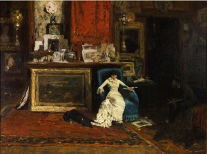
6. The Inner Studio, Tenth Street. Oil on canvas. 1882. Huntington Library and Art Gallery, San Marino, California.
Back in New York Chase believed his most important task was to secure a prestigious studio. He was able to rent a small studio (15′ x 20′) in the famous Tenth Street Studio, the first commercial building designed to house artists, located between Fifth and Sixth Avenues, which housed studios of America’s most prominent artists. Chase, however, had his eyes on the large two-story studio, originally designed as an exhibition space, but recently occupied by Albert Bierstadt. To the annoyance of the more established artists, who believed their greater fame and longer residence entitled them to priority, Chase obtained the studio and symbolically replaced arguably the most famous Hudson River School painter in America.
The large studio would become the place where Chase worked, a subject of numerous paintings and the center of his self-promotional energies. During his student days Chase concentrated on works in which he could paint a model costumed elaborately and surrounded by visually interesting objects. Chase therefore filled his studio with objets d’art, bric-à-brac and other decorations. The studio itself became the background in many works. Tenth Street Studio (#5), begun in the early 1880s and completed some three decades later, not only shows how he used the studio in his paintings but also symbolically reveals his view of art itself. The painting has two visitors inspecting a painting in the middle of a long wall of the studio filled with paintings and other objects including a large stuffed swan. Two others are seated on the left looking at sketches on a table. But none of the four figures are completed, and their faces are obscure. In fact, it is only the paintings and other artistic objects that are clearly rendered in detail. Although schooled in European realism, Chase makes the point that it is art that is “real.” Indeed, in all his early studio paintings Chase drives home the idea that art is valuable in itself, and that he himself is a prophet of that belief.
The Inner Studio (#6) shows another art devotee, this one perhaps more serious than the visitors in the later Tenth Street Studio (#5). Like a temple with its inner sanctum, Chase’s studio has an Inner Studio, and here the model, back to us, closely studies a framed painting, while a matted picture lays on the floor to her left. There is a gold bowl to her right. The things surrounding her represent the tools of this priestcraft, things prepare the soul to enter the mysteries of the world of artistic beauty.
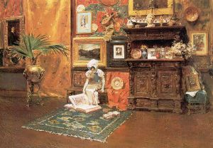
7. Tenth Street Studio. Oil on canvas. 1880. St. Louis Art Museum. St. Louis, Missouri.
The 1880 Tenth Street Studio (#7) makes a somewhat different point. Beauty and luxury and elegance are, for Chase, intimately related. This is true for the artist as well as the art patron. Chase could not fail to understand the interrelations of these qualities is what attracted the wealthy patrons that were his market. The studio itself was something of a gallery in which he could display his works to the select public (e.g., #5). The more attractive and engaging the space, the more of a luxurious atmosphere it surrounded the visitor with, the more likely it was that the visitor would wish to purchase a painting or commission a portrait. But it was probably was not entirely a marketing ploy; “art atmosphere” meant something to him. Yet his beliefs mereged with a kind branding that came natural to Chase, who was not hesitant to make decisions that might enhance his fame and marketability. He joined all the important artistic associations in New York and founded others in order to associate himself with energetic and like-minded artists. He became a friend of most of the important intermediaries in the art world, first the publishers of art journals and books and later the curators of the major galleries and museums. The studio provided space for social and cultural events he sponsored. He held open houses on Saturdays. And he frequently had his students to his studio for a variety of lessons, not the least of which was to inculcate them with his view of the place of art in society and how to approach it. The studio accommodated every part of Chase’s life, and Chase’s life was consumed by the quest for elegance, style and beauty. He became almost a caricature of the new artists, who could only exist in this new, urban and increasingly prosperous America. And while he courted the New York elite, he did so to draw them into his own world, a world where everything was involved with art, a world entirely like the old, rural, pre-industrial America.

8. May I Come In?. Pastel on canvas. 1886, Collection of W. & E. Clark.
For Chase the studio was where art was made.That statement seems unremarkable now, but in the late 1870s it marked a new kind of artist and also drastically different subjects for art. Aside from portraits (mostly uninspired likenesses designed as mere memorial keepsakes), American art American art was about Nature, often wild and untamed, but sometimes in harmony with frontier and rural folk who have barely tamed it. American artists worshipped at the altar of Nature; painters were Nature’s celebrants and painting its ritual. To properly capture the essence of Nature, artists painted outdoors. And therefore the outdoors were the painter’s studio; indoors, where paintings were finished, were simply workshops. Inspiration was obtained by personally experiencing the beauty of the natural world, and the artists’ job was to communicate that awe and wonder through representational (if overly romantic) pictures.
Unlike the artists who occupied the field of American art before those of Chase’s generation returned from Europe, Chase believed that art itself is what the painter owed his allegiance to. The previous generation worshipped Nature and believed art celebrated it: painters were Nature’s celebrants and painting its ritual. And therefore the outdoors were the painter’s studio; indoors, where paintings were finished, were simply workshops. Inspiration was obtained by personally experiencing the beauty of the natural world, and the artists’ job was to communicate that awe and wonder through realistic (if romantic) pictures.
Chase, above all his generation in America, promoted the new European view that Art existed for its own sake, not to represent a higher ideal. Nature was not the exclusive, or even primary object of Art, and artists did not have to commune with it for experience. In fact, in the early 1880s he told his fellow aesthetes at the Tile Club that even if one painted landscapes it should be done in the studio:
“The proper way to paint a landscape is in the studio, far from the thing itself. You must simply look at a scene you are going to paint, observe the detail, saturate yourself with it. Then you have the spirit within you and can paint it later under ideal conditions, taking plenty of time to work it up to perfection.”7
Indeed for Chase, the studio was the center of art-making. It not only provided the props for works and a convenient place for models to pose or patrons to be painted, it also, and more importantly, generated the inspiration for his work. And for that reason it had to be filled with beautiful objects. In a 1906 lecture at the New York School of Art Chase ascribed to their studios the inspiration that the Old Masters displayed: “the secret of the success of the old masters … was their environments—and it was this influence that helped to produce their great works. It is really that in art that counts and it was this kind of art atmosphere that was of importance.”8 This belief drove Chase’s need to acquire “beautiful things,” and that in turn drove him to live beyond his means, a habit he never really conquered even once he had a large family to support. His first biographer Katherine Roof (at 254) said, “No man ever lived more completely in the atmosphere and the idea of art than Chase did.”
9. In the Studio. Oil on canvas. ca. 1881 or 1882. Brooklyn Museum, Brooklyn, New York.
That Chase justified his need for an “art atmosphere” by reference to the Old Masters was not simply rationalization. His view of beauty was deeply rooted in the tradition of Western Art that went back to the Baroque. His two points of reference throughout his career were the Northern European (particularly Dutch) art of the seventeenth century and the collection of the Prado, especially Velázquez. Chase saw his own art as part of that tradition and often harkened back to the originators in his composition, treatment of light, posing of models and so forth. Although he could not articulate it clearly, Chase’s view of “beauty,” what it constituted, what objects possessed it, how to show it, was not a mere solipsism, but rather a view supported by deep study of the past. And often in his works he made allusion to that past. The early work In the Studio (#9), for example, is another picture of a richly clad devotee of beauty studying art while surrounded by objects selected and arranged by Chase. In nearly the very center of the painting is a framed etching of “Malle Babbe” by the Dutch master (or student of) Frans Hals, one of Chase’s favorites. The reference has interest beyond the mere statement that Chase’s art is part of that traditon, for the painting by Hals is of a subject not conventionally beautiful. Its inclusion states that the beauty in art is in the technique and execution, not the subject.
By surrounding himself with his version of beauty Chase made his studio nationally famous. It became the emblem of eccentric artistic genius and regularly appeared (and sometimes was satirized) in fiction, such as Esther by Henry Adams, The Coast of Bohemia by William Dean Howells, The Third Violet by Stephen Crane, The Other Fellow and Tile Club Stories by F. Hopkinson Smith, and even after his death in The “Genius” by Theodore Dreiser. And it frequently was discussed in the art journals. It was said to be a place that aspiring artists and artists of all sorts from outside of New York City made a pilgrimage. All of this gave Chase an added layer of celebrity, and in trying to enhance it, his religion of aestheticism led him into foppery, dandyism and, frankly, embarrassing and offensive behavior. Not only did he fill his office with pottery, elaborate furniture, Japanese umbrellas, old books, fabrics, fans, tapestries, brass pots, glazed glass objects, costumes and the like, he kept a cockatoo, 10 macaws and a Russian wolfhound and another dog. He forced his African-American servant Daniel to dress in exotic outfits when serving guests, and he often would strut through Manhattan with ridiculous affectation:
“He walked down Fifth Avenue dressed as an elegant Parisian art student with his Russian wolfhound and Daniel in tow wearing his Nubian costume. Chase wore a narrow, flat-brimmed French silk hat and a soft tie, both highly unconventional, as well as several rings from his growing collection. Chase ‘the cosmopolitan’ appeared sophisticated and cultured to the rich and the well-born.” (Bryant, at 68.)9
In the end, however, the affectations did not pay for the show, or perhaps Chase’s excesses were too much for the revenue of his patrons. While he maintained the studio through 1895, when he auctioned its contents (including many of his own paintings) in January 1896 he received only a fraction of their purchase price (Bryant, at 173). Although he would maintain more modest studios thereafter for portrait commissions, he had transitioned from nineteenth century hipster to establishment academician by that point. Before then Chase would make his mark on American art in a couple of other ways.
Portrait Artist Extraordinaire

10. An Idle Moment (also At Her Ease or Study of a Young Girl). Oil on canvas. ca. 1884. National Academy of Design, New York City.
Chase’s principal claim to early fame and his most reliable source of income from his art came by way of his portrait paintings. Not long after he returned to New York City from Munich, he was regularly given official commissions for prestige portrait projects.10 By and large Chase’s portraits of men intended to promote their official or institutional capacity (including formal family roles like pater familias) and seem stiffly formal or out-of-date today. Many of Chase’s paintings of women, by contrast, reveal personality while also conveying a sense of style and elegance. Chase’s interest in figure painting, of course, went back to his original interest in art in Indiana, and his studies in Munich concentrated on figures (as well as still lifes). Even during his first stay in New York in 1869-70, while studying at the National Academy of Design, Chase was accomplished enough to obtain commissions for portraits. But over his career his portraits of girls and women seemed to have gained strength mainly by his interest in composition and the poses of the subject in addition to his mastery of the textures of clothing and accessories.
From his student days (e.g., ##1–2) Chase had a flair for discovering poses that illustrated an attitude. That talent only improved when he began his annual trips to Europe to meet with contemporary artists and study unfamiliar old masters beginning in 1881. That particular summer proved highly influential to Chase’s career, for he met arguably Europe’s three most prominent painters of women of high society and began a close study of the golden age artist who would inform his portrait technique. During two weeks in Paris in the early summer fellow Art Students League teacher James Carroll Beckwith introduced him to his teacher Carolus-Duran and arranged a lunch with American expatriate John Singer Sargent. Returning to Paris in September he met Belgian impressionist Alfred Stevens at his studio. That meeting had a substantial effect on Chase. Stevens had seen Chase’s The Smoker (his portrait of Duvaneck, an etching of which preceded the first Van Rensselaer article [linked below]), which had received honorable mention at the Paris Salon that year. Stevens advised Chase to lighten his palette from the dark values preferred by the Munich school. He also urged Chase to strike off on his own and not attempt to recapture the forms and techniques of the old masters. Chase seems to have almost immediately followed the former advice (as can be seen by comparing #9 with #7 among the “studio” piictures). But Chase had more difficulty with the second recommendation, especially because he had spent the time between his two trips to Paris that year in Madrid and he fell under the influence of Velázquez. He would spend five weeks again in Madrid with his friend Robert Blum (producing drawings for Scribner’s) the following year, and Velázquez remained under the Spaniard’s thrall for the rest of career as a portrait painter. (In 1894 he named his fifth daughter Helen Velasquez.)

11. Portrait of Mrs. C (Alice Gerson Chase). Oil on canvas. ca. 1890-95. Carnegie Museum of Art, Pittsburgh, Pennsylvania.
Chase’s reliance on old masters, particularly in his portraits, probably served a number of purposes. In the first place, Chase undoubtedly saw it as an homage, and perhaps also a way to influence American art to incorporate and become part of the broad European art tradition. Quite frequently he would borrow poses from the masters. Chase’s intriguing picture of his wife, Portrait of Mrs. C. (#11), is an example, for it is clearly based on Van Dyck’s portrait of the one-armed Flemish artist The Painter Martin Ryckaert (ca. 1631, Prado, Madrid). Not only is the composition nearly identical in both (with the seated figure occupying nearly the entire frame), but their postures in the chair are also strikingly similar. Moreover, Chase costumed his wife in a way to recall the earlier picture, with a heavy coat amd fur lining. They both even sport unusual and colorful caps. But the uncanny treatment is how Chase had her throw the left arm of the coat over her side to mimic the empty sleeve of the one-armed artist. And finally the subjects in both portraits stare directly forward. What makes both portraits fascinating is how the ambiguous expression of both requires the viewer to ponder what the subject is thinking and to decide to what extent he will participate in that contemplation.
12. Lydia Field Emmet. Oil on canvas. ca. 1892. Brooklyn Museum, Brooklyn, New York.
Chase turned to Van Dyck again for the pose of his student, who acted as model in Lydia Field Emmet (#12). Left arm akimbo, she looks over her shoulder from a reverse, three-quarter view just as does the younger brother in Lord John Stuart and his Brother, Lord Bernard Stuart (ca. 1638, National Gallery, London). The subdued palette of the composition probably was under the influence of Whistler, who Chase grew to greatly admire. In fact, the scheme as well as the overall composition is similar to Whistler’s Arrangement in Black & Brown: The Fur Jacket (ca. 1876, Worcester Art Museum, Worcester, Massachusetts). It is the dress’s trimmings and the long ribbon that flows down her back onto the floor that makes Chase’s work distinct from that of Whistler, who was not aiming to achieve the effect of “eloquence” which was Chase’s main goal.
On another occasion Chase subverted one of Whistler’s experiments in An Idle Moment (#10). The work Chase played off of was Whistler’s most famous compositional experiment, Arrangement in Grey and Black No. 1: The Artist’s Mother (1871, Musée d’Orsay, Paris). Chase starts with the basic compositional framework of Whistler, a nonsymmetrical view of a woman in a chair facing perpendicular to the viewer. He then subverts most of the other elements. In the first place Chase’s sitter is very young, whereas Whistler’s is old. Whistler’s mother sits very formally and rigidly, whereas Chase’s lounges to relax. Whistler’s mother wears an old-fashioned cap, but Chase’s model’s hair pours out in a very modern manner. It is the color scheme, however, where the greatest divergence is noticed. Whistler employs his customary and restricted palette, emphasizing darker values. Chase, by contrast, employs flamboyant reds to envelop the velvety black dress the model is wearing. The combination turns Whistler’s staid formal “arrangement” into a lively expression of youthful luxury.

13. James Abbott MacNeill Whistler. Oil on canvas. 1885. Metropolitan Museum of Art, New York City.
Whistler would remain a fascination for Chase for the rest of his life. In his last two decades Chase gave talks on Whistler, much to the latter’s annoyance. He wrote (in “The Two Whistler’s” linked below) that his fascination took hold while at the Prado: “Every Velasquez seemed to suggest Whistler … .” So he resolved to meet him, but it took several failed attempts before he gathered the nerve to introduce himself to the notoriously caustic and unpredictable egoist. To his surprise upon meeting him in the summer of 1885, Whistler was charming and solicitous of Chase’s regard. Eventually, however, Whistler became smothering and grew increasingly annoying, and Chase sought to escape his grip. So avoid losing Chase Whistler proposed that they each paint the other. Whistler painted Chase in his plodding meticulous fashion, causing Chase to stand well into the evening for many days. That painting has since disappeared. Chase’s painting of Whistler, however, is at the Metropolitan Museum in New York (but now in the Chase exhibition at the MFA).
Chase portrayed the “public” Whistler, who he characterized as “the fop, the cynic, the brilliant, flippant, vain, and careless idler …” (and this was written by a painter who had his “man” dress as a “Nubian” on Fifth Avenue). Emphasizing his proportionately too large walking stick, Chase painted him as he described him: “a dainty, sprightly little man, immaculate in spotless linen and perfect-fitting broadcloth. He wore yellow gloves and carried his wand lightly in his hand. He seemed inordinately proud of his small feet and slender waist; his slight imperial and black mustache were carefully waxed; his monocle was indispensable.” As for his personality: “He took no one and nothing seriously; he was sublimely egotistical, and seemed to delight in parading his conceit. He was trivial, careless, brilliantly and smilingly careless.” Chase even painted the small shock of white hair which Whistler carefully ironed and curled at a mirror before presenting himself to the public. Of course, Chase had a dramatically different view of the artist Whistler, who he admired and defended the rest of his life. But the painting was of the public Whister. And Whistler saw only maliciousness in the portrait. He complained to The World (October 15, 1886): “How dared he, Chase, do this wicked thing?—and I who was charming and made him beautiful on canvas—the Masher of the Avenues.” The two never reconciled.

14. Portrait of Miss Dora Wheeler. Oil on canvas. 1883. Cleveland Museum of Art, Cleveland, Ohio.

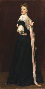
15. Portrait of Mrs. C. (Lady with a White Shawl). Oil on canvas. 1893. Pennsylvania Academy of Fine Arts, Philadelphia, Pennsylvania.
Constraints of space (and your patience) prevent comments on the many highlights of the gallery containing the Chase portraits. I will even skip over the one that Chase himself regarded as his best portrait: Portrait of Lady C. (Lady with a White Shawl) (#15). Instead I will treat an earlier portrait, one that deserves especial note, because it marked such a turning point in Chase’s career, and it too had a connection with Whistler. The painting is Portrait of Miss Dora Wheeler (#14). The work is one of his first major portraits, and one that Chase evidently designed for exhibition, for it was not commissioned nor even painted in his own studio. Dora Wheeler was Chase’s first private student in New York and a pioneer as a woman in fine art. Her mother founded Associated Artists, a firm of women who produced high quality needlework and decorative textiles for the same strata of patrons that Chase was looking to see oils. Dora’s mother realized the limitations a woman artist of the time labored under without instruction, so she sent her for instruction to Chase (who taught her along with Lydia Emmet (#12)), then to the Art Students League and finally for two years to the Académie Julian in Paris.
Chase was unusually progressive in supporting women in fine arts. He not only taught them the same way he taught men (including with nude models), but he also bought their paintings. He considered Wheeler talented enough that he made a concerted effort to support her. The portrait, painted in her own studio, is of an artist, not a mere prop in a studio full of fineries. He gives her the seriousness of a professional rather than an idealized figure, a fact that the American reviewer for Magazine of Art highly objected to: “The first necessity of a portrait from the point of view of art is, of course, not that it should be resemblance, but that it should be agreeable, and agreeable this portrait certainly is not.” But of course “agreeableness” is in the eye of the beholder, and Chase was ahead of his time in in his view of the proper role of women, at least in art. Unlike Chase’s earlier studio paintings (e.g., ##6, 7, 9), Wheeler is not a mere decoration; she is fully the center of attention and dominates the scenery. Nor is she painted as a figure of “elegance.” Her face is serious, but she makes no effort to display her hands or even slippered feet in a graceful manner:
“Miss Wheeler may be the most forceful, dispassionate study of personality Chase would ever produce; her closest affinities are with the penetrating psychology of Thomas Eakins’ female portraits of the late 1880s rather than with the fluffy inconsequence of debutantes at the 10th Street Studio. Intelligent eyes, frank in confrontation beneath vast, careless brows; a long, distinctive nose; an angular chin, wispy curls low on the forehead, refusing the discipline of elegant coiffure—these are not the attributes of conventional beauty. Even the placement of the feet and hands bespeaks a woman whose demand for recognition is premised upon individual qualities.” (Marlin, at 47.)

16. I Think I am Ready Now (The Mirror, The Pink Dress). Oil on canvas. ca. 1883. Private collection.
The rest of the composition surrounds and supports her with the kind of eloquence that Chase (and Wheeler) believed comported with Gilded Age aesthetics. Her English revival chair and the taboret to her right allow Chase to show his ability to represent carved and polished wood. Meanwhile the vase provides the reflective surface that Chase liked to depict. The color scheme of the work uses hues of the three primary colors, with the vase and her dress dominated by blue, the carpet red and the background drapery and daffodils yellow. (Oddly, Chase once admitted that he had difficulty with flowers, and in fact he rarely painted them.) It is with that background hanging that Chase lets loose his bravura brush strokes, producing swirling yellow background around the flowers and throughout. The curtain sports an oriental effect with its waterfowl, dragonflies, butterflies and the cat within a swirl of yellow. The butterfly and the cat, perhaps performing the function of a colophon, may be tributes to Whistler.
Chase entered the Wheeler painting in the Internationale Kunstaustellung in Munich, and despite the reaction of the American reviewer was awarded a gold medal by the jury. After that the work was hung in the Paris Salon, the same one that saw Whistler’s Arrangement/Portrait of his mother. William Milliken has opined that the Wheeler portrait is the principal basis for Chase’s European fame.
It was in his portraits, especially in the commissioned ones, that Chase continued to freely indulge his belief that art was, in essence, simply technique, something he already showed in his studio genre works. The portraits, however, were less populated with objects on which Chase could lavish his brushwork. Nevertheless, Chase always dressed his subjects in finely worked fabrics and furs often with other accessories. Chase could then concentrate on rendering lace, ribbons, stitching and texture with intricate care. Despite criticisms he received that his attention to surface at the expense of story or theme or concept made his art superficial, he maintained as late as an interview in 1899 that technique is the eloquence of art and that “[w]hatever success I may have attained comes from my love of art for art’s sake only” (Brant, at 126 & 128). So, to the extent that the Wheeler portrait represented a turning point, the turn came not so much in portraits (which, after all, depended on client patronage) but in his new field, impressionism-influenced outdoor paintings.
Outdoors: From Europe to New York Parks
Chase had almost no formal training in landscapes. While studying in Munich, however, Duveneck discovered a picturesque retreat in the Bavarian Alps in a town named Polling about 25 miles to the south. In 1875 he, Shirlaw and Chase rented an abandoned monastery there, where they could paint pictures of country life. The students hired peasants to pose, and they had access to sheep and cattle for their work. Chase’s few paintings there were heavily influenced by Corot (whose work he was familiar with from his annual visits to Paris and the French art periodicals he acquired in Munich) and the atmospheric effects of Currier (the American landscape painter who was a fellow student at the time). Like all of Chase’s work at the time, the paintings were technically accomplished, but unlike his figure paintings, showed little originality.

17. Venice. Oil on canvas. 1877. Oklahoma City Art Museum, Oklahoma City, Oklahoma.
In 1877 Chase spent nearly a year with Duveneck and Twachtman in Venice. But he doesn’t seem to have taken advantage of the light, water, buildings and subtropical effects of the city and environs to an optimum extent. Many of the works, such as Venice (#17), seem to have been painted from inside his apartment. This may have been owing to the serious illness (perhaps malaria) he contracted while there. Nevertheless, Chase began exploring outdoor subjects and effects. Venice is a careful treatment of the effect of sunlight on mineral and stone surfaces. The composition places the flower pots on the balcony at the center of our attention, and they, together with the brightness of the reflection, almost make us miss the woman leaning out of the window in the upper left corner.
Chase’s small outdoor painting In Venice (#18) is somewhat remarkable given that the composition prefigured later work by Sargent and Renoir in Venice. The painting, though relatively small (8 x 13″), allowed Chase to capture differing effects of sunlight on the two sides of buildings as well as on the water before them. The restricted and muted color palette is broken with an exclamation point of red on the hat of the gondola rider in the center. All of this is done with the same easy brushstroke that he employed in Venice and that was commonplace in his figure paintings. It was thus a step forward from his work in Polling.

18. In Venice. Oil on canvas. ca. 1877. Rhode Island School of Design Museum, Providence, Rhode Island.
After Chase returned to New York City in 1878, he not only neglected landscapes, he also actively promoted the idea that the artist’s proper role was in the studio, as we saw. This was all part of his effort to replace the Hudson River School with his view of Art for Art’s Sake vision of American art. But his views on outdoor painting began to change when he started his annual summer trips to Europe to inform himself of new developments. In the sumer of 1882, during his stay in Madrid he began outdoor painting again, perhaps attracted to the very bright Madrid sun. (No example of this work is in the MFA exhibition.) It was in 1883 that Chase began the transformation that turned him into a master landscape painter of the new school.

19. A Bit of Holland Meadows (A Bit of Green in Holland). Pastel on paper. 1883. Parrish Art Museum, Water Mill, New York.
Chase’s work in Holland in 1883 was connected the proposed exhibition of the Society of Painters in Pastel, an organization he founded in 1882 with Blum and Beckwith. The medium had become “legitimized” by such European artists as Mary Cassatt, Edgar Degas and Whistler. Chase undoubtedly familiarized himself with their works before working with the medium in Holland. One such painting is included in the MFA exhibit, A Bit of Holland Meadows (#18). The color is remarkably bold for a Chase landscape at the time. It is as much a turning point for Chase as was the Wheeler portrait (#14) completed the same year. As with the portrait, in the pastel landscape Chase began conceiving of composition as something more than a way for him to display treatment of unusual and different surfaces. Indeed much of A Bit of Holland Meadows is occupied with relatively undifferentiated surface. This too may be traced to Chase’s principal influence in the Wheeler portrait—Whistler. Pisano (1993, at 6) notes the similarity between Chase’s Holland pastel and Whistler’s 1866 seascape Symphony in Grey and Green: The Ocean (Frick Collection, New York), particularly the “sparseness of detail the asymmetrical composition, and the flat decorative patterning … .” The paintings even have similar leaf designs on the right; Whistler’s comes from the bottom, presumably from a bush on the land above the shore where the viewer is standing, while Chase’s comes from the top from a tree. In Whistler’s work of the time the leafy branch acted as something of a colophon derived from Japanese prints. Both works also involve a high horizon line and vast expanses of green, although Whistler’s is much paler than Chase’s. The brushwork in Chase’s midground (where no individual clumps of grass can be seen) is very much like a watercolor, and it may have been influenced by the Hague School watercolorists, which Chase must have seen at the time. Another Whistler that may ave informed Chase’s approach, one closer in time to Chase’s composition and also in pastel, is San Biagio: Flesh Colour and Grey (1880, Museum of the Shenandoah Valley, Winchester, Virginia), painted in Venice, which could have been of especial interest to Chase. I’ll leave it to you, the reader, to discover the similarities and differences.

20. At the Shore. Oil on canvas. ca. 1884. Private collection.
By the following summer Chase’s approach to landscapes was undergoing a remarkable change. While more attention was paid to composition, at the same time, Chase was simplifying the other elements. A good starting point is At the Shore (#20), painted sometime between 1882 and 1884. The work is very bright for Chase in this period, and this perhaps is the lingering effect of his Madrid experience. The brushwork has become as assured, bordering on bravura (especially with the ocean foam, sand, flags and canvas tops), as his studio work. His rapid sketching of persons gives the impression of a casual glance, and while the work contains quite a few people, the composition does not look crowded, largely owing to how the shore divides the composition in two and the structures recede into the background (along a line perpendicular to the shoreline). What is striking about the work, however, is the large area devoted to a sky with striking blue mixed with clouds. The horizon (on which we see steam ships adding to the mix of the sky) curves upward much like the curve of the canvas atop the boat in the foreground. The composition is cleverly designed but not as simplified as it would soon become.

21. Coast of Holland. Oil on canvas. 1884. Frye Art Museum, Seattle, Washington.
When Chase painted in Holland in the summer of 1884, he produced two major works which pointed toward his future direction, both are in the exhibition. One, Sunlight and Shadow (Joslyn Art Museum, Omaha, Nebraska), experiments with dappled sunlight and compositionally resembles the later family genre painting Open Air Breakfast (ca. 1886, Toledo Museum of Art, Toledo, Ohio). Both those exhibited works are fairly famous, so I will leave it to the links if you wish further comment.11
The painting that most clearly shows Chase’s future direction is Coast of Holland (#21). Like A Bit of Holland Meadows, Coast of Holland has a large expanse of “empty” space in the fore- and midground as well as a high horizon. A line of posts supporting a wire fence leads the eye in a curved fashion from the left edge towards the matter of interest in the background (in this case a sea churned by the strong winds, evidenced by the three flags along the water’s edge). Two heavily clad figures can be seen on the left, but what they are doing is not clear. In fact, their presence is somewhat superfluous. The general plan of composition as well as the green and brown color scheme of the land will be seen in the landscapes Chase would paint at Shinnecock about seven years later.

22. End of the Season. Pastel on board. ca. 1884 or 1885. Mt. Holyoke College Art Museum, South Hadley, Massachusetts.
After his return to New York Chase tried a seaside picture, and once again by using pastel he created an astonishing composition, perhaps the most clever work he ever created, considered solely from that point of view, End of the Season (#22). Once again a sandy green-brown land occupies much of the bottom of the small picture (13¾ x 17¾”). The sea then makes a very high horizon. In this case, however, the expanse of sandy grass and scrub vegetation is not empty; rather, the field is filled with empty tables with their chairs turned on them. The line of tables and chairs (which form an interesting cross-hatch pattern) curve around to the place where the last vacationing visitor is looking–towards men grappling with a sailboat. The end of summer is indicated not only by the upended chairs but also by the coat worn by the visitor. A calm sense of wistfulness is conveyed by the painting at the same time that it is pleasantly (if conventionally) colorful.
It is curious that so many of Chase’s experiments, like End of the Season, took place in pastel. Perhaps the nature of the medium restricted his easy brushwork and required more concentration. Perhaps because it did not allow him to dwell on intricate surface detail, he devoted his attention to other elements. Or perhaps because the lighter palette it brought suggested to him different subjects and artistic models. The latter has some support when we look at his cityscapes with their impressionistic influence and lighter colors.

23. A City Park. Oil on canvas. ca. 1887. Art Institute of Chicago, Chicago, Illinois.
From the late eighties to the early nineties Chase embarked on a genre that was new to America: outdoor scenes of city parks. American landscapes before this time were of course mainly of rural and wild settings. Urban metropolises were just arising in America, and the public park movement was only in its infancy. Frederick Law Olmsted had only designed Prospect Park in Brooklyn in 1865, Chase began painting urban park scenes around the time of his marriage in 1886, when he stopped his summer European travels to care for his young family. Many of the scenes involved his wife and first child, Alice (“Cosy”) Dieudonnée. There was thus practical reasons for him to turn his attention to landscapes near his new home. But there was an artistic incentive as well: In April 1886 a large exhibition of French Impressionism was mounted in New York City.
The French Impressionism show at the American Art Association, which opened on April 10, 1886, was a startling event for the staid and conservative art world of New York. Some American painters had engaged for some time in an informal version of Impressionism, without the strict attention to the underlying principles of the French movement. The American Art Association exhibition, however, was the real thing, with 300 items, including numerous paintings by Monet, Degas, Manet, Renoir, Pissarro and Seurat. Those reviewers most closely connected with the conservatives of the National Academy of Design roundly condemned the foreign painters. The New York Times chose supercilious condemnation:
“The 300 oil and pastel pictures ‘by the Impressionists of Paris’ belong to the category of art for art’s sake, which rouses in the public more mirth than a desire to possess it. Coming suddenly upon the crude colors and disdain of drawing, which are traits positive and negative in the works of Renoir and Pissarro, one is likely to catch the breath with surprise. Is this art? Surely a third-rate Scotch artist far behind Faed or Cameron would be ashamed of No. 178, ‘Fisherman’s Children,’ but his style would resemble that. Helpless American painters of the old Hudson River school might blush, if they could not model human figures better than Seurat in No. 170, ‘Bathing.’ Weak imitators of Holman Hunt would be truer in color than Flameng in his clouds, No. 285, ‘Wrecks at Bordeaux.’ The first feeling about such works as these is, what extraordinary impertinence on the part of the artists! It is like turning the wrong side of the stage flies to the audience; it is offering to the public work which has been prepared up to a certain point only. No wonder that people are indignant. No wonder that artists who are not in sympathy with the undaunted band of Impressionists affirm, sometimes not without a round expletive, that they can turn out several such canvases every day in the week!”12

24. Thompkins Park, Brooklyn. Oil on canvas. 1887. Colby College Museum of Art, Waterville, Maine.
The Brooklyn Daily Eagle simply heaped ridicule and contempt on the art: “As a mark for ridicule the impressionist display has been a conspicuous success. Few have regarded it as other than a display of monstrosities and crankisms, and one artist writes to me that he went home from the show and proceeded to have a nightmare as soon as he had fallen asleep.”13 The more forward looking artists of Chase’s circle, however, greatly admired the works. Many of them already referred to some of their work as impressionistic, but they had not seen, until the New York show, the full extent to which the underlying principles of French impressionism could be taken. American impressionists would never fully employ the advances of the French artists in the exhibition. Chase, for example, did not believe in the “scientific” approach to light that some impressionists showed. Chase felt that such an analytical violated the principle of artistic inspiration, relying instead on a set of rules. Moreover, the approach of most French impressionists to brushwork was entirely inconsistent with the broad strokes that Chase had worked more than a decade to make effortless. Nevertheless, although Chase’s reaction to the show does not seem to have been recorded, it is clear that he rejected the blanket condemnations of the conservative press. In 1883 when Chase and Beckwith organized the Barholdi “Pedestal Fund Art Loan Exhibition” (to raise funds for the pedestal of the Statue of Liberty), Chase was instrumental in bringing Manet and Degas painting to the event.

25. Park Bench. Oil on canvas. ca. 1890. Museum of Fine Arts, Boston.
To whatever extent the Impressionism show influenced Chase, it is clear that his park paintings represented a new and separate departure for him. Just in terms of the elements of the works, a novel and fairly consistent combination had taken hold. Chase framed views of small sections of well-maintained public spaces. Lawns and ornamental plants cover most of the space with buildings, if shown at all, off in the distance. Figures inhabit the scenes but are almost never the focus of attention. These people are well-t0-do, expensively dressed Brooklynites or New Yorkers at leisure, often with their children. The compositions frequently emphasize lines that not only lead toward a vanishing point but also divide the picture into geometrically designed segments that are dominated by a particular color. The lines direct the eye to quickly survey the scene, which adds to the effect of a fleeting impression which the brushwork aims for.
Chase began this series of paintings in Prospect Park, Brooklyn, near his then home. After several years working there, in the spring of 1890 he was barred from painting in the Park by order of the Brooklyn Parks superintendent, much to the outrage of the local press.14 Chase unsuccessfully attempted to obtain a license that summer, so he chose to paint in New York’s Central Park thereafter. Some of his paintings in the Manhattan show recognizable man-made monuments or other enhancements. Four of these paintings were featured in an article in Harper’s Weekly in 1891.15 Some focus on common features in recognizable locations, such as Park Bench (#25). This last painting emphasizes the inert bench which dominates both the young woman sitting on it and the two sparrows she is watching.
Chase did not follow the French impressionists either in their experiments with light or with their experiments with colors. Moreover, Chase did not veer at all from realistic representation of figures and things. And Chase’s impressionism-influenced park paintings did not treat any of the grittier city scenes, but instead painted the city from a distance in its semi-natural parks. Nevertheless, the paintings were still attacked by conservative critics. The reviewer for the Art Amateur of an exhibition at the American Art Galleries praised Chase’s portraits but had little regard for the parkscapes, concluding that they showed ‘no traceable intention … but that of reproducing the scene as in a looking-glass, with the least possible expenditure of work.” He conceded that revealed a “discipline of eye and hand” but in the end found them to “have no depth of meaning, and their beauty is of the every-day sort … .”16
The MFA exhibition only has a small sample of the city park paintings, and in any event they tend to have a sameness to them. While they represent a step in the direction of European advances, the subject matter, visual frame, color palette and treatment and intended effect tended to fall into a pattern. Chase would defend this fact on the ground that technique, and not subject matter, is the point of art. Right at the beginning of the period he spent making city park paintings, however, he painted a genre work titled Washing Day: A Back Yard Reminiscence of Brooklyn (#26). Although in some ways similar to the park paintings, particularly with the clotheslines acting in the same way that lines of paths and park sections do to direct the viewers eye and create sections of the work, the painting shows a scene rarely attempted by Chase—a person at work. It is the sheets, though, that give Chae the opportunity to make light reflection into a pattern, not only on the lines but on the ground between them. Behind this work are trees that themselves provide a pattern of light (which appears to be coming from the left of the picture). A decade and a half later John Singer Sargent would employ the same concept in a watercolor, using instead of the colored linen, pure white sheets, which produce more of a patterned effect with reflected white and shadow, in front of small leafless trees. (To see a comparison of these two works, scroll to the bottom of the post Sargent’s Watercolors.) The painting is the kind of original concept approach that Chase abandoned once he hit upon the open air paintings in city parks.

26. Washing Day: A Back Yard Reminiscence of Brooklyn. Oil on panel. ca. 1886. Lilly Endowment, Indianapolis, Indiana.
Shinnecock and the Summer Art School

27. My Baby Cosy. Pastel on board. 1888. Private collection.
Chase was plagued his whole life with a taste for compulsive acquisitions that exceeded his ordinary income. His need for money only increased when he married Alice Gershon in 1886 and the large family that resulted, beginning with the birth of Cosy in 1887. Chase tried to reduce his expenses by ending his summer trips to Europe after his summer with Whistler in 1885. But from time to time he also attempted to obtain large sums by selling his works (and often his collections of others’ works) at auctions. Invariably, these sales, some of which were quite large, proved bitterly disappointing to Chase and a subject of astonishment to his friends and even the art press. Chase was forced to rely more and more on income from teaching. In 1885 he again took a position at the Art Students League. In 1887 he held an auction of 98 works after his first major solo exhibition in New York, and realized less than $90 per work. In 1889, two months before the SAA show that caused the Times reviewer to muse on Chase becoming unfashionably establishment, his second daughter, Koto Robertine, was born, and in June 1890 his son, William Merritt Chase, Jr. was born. The growing family probably convinced him of the wisdom of supplementing his income with a more-or-less permanent summer school proposed by Mrs. William S. Hoyt, in the eastern end of Long Island to be called the Shinnecock Hills Summer School of Art.

28. The Japanese Doll. Oil on canvas. ca. 1890. Walter & Lucille Rubin collection.
The school was located in a relatively unimproved area that a few fashionable New Yorkers had begun to develop for summer retreats. Janet Hoyt, a real estate professional and investor in her own right, managed the project to create the school and design an art village that would not only attract students of plein air painting but also become the catalyst for attracting others to purchase real estate in the area. She was assisted by two Southampton friends, Annie de Camp Perrot Hegeman Porter and Samuel L. Parrish, and together they obtained support from Mrs. Andrew Carnegie, Mrs. William K. Vanderbilt, Mrs. August Belmont and various Astors and Whitneys. Chase presided over the school for 12 summers, and it became the largest and best known of the plein air summer schools. It was a breeding ground for artists who would set up schools elsewhere as well a basis for Chase’s national fame as an art instructor which would later allow him to create his own full time school in New York (the Chase School of Art in 1896) and generated offers for permanent employment (such as at the Pennsylvania Academy of the Fine Arts in Philadelphia, where Chase began teaching in 1896) and short term courses (such as at the Art Institute of Chicago in 1894 and 1897). But for our purposes the significance of the move is how it changed his approach to outdoor landscape painting.

29. Shinnecock Studio Interior. Pastel on paper mounted on canvas. 1892. Terra Foundation for American Art, Chicago, Illinois.
At the end of the 1880s Chase was beginning to look for subjects beyond his portraits, studio views and parkscapes. Chase had a brief flirtation with Japonisme in the late 1880s. One of the interesting insights the MFA show provides is through collecting the little known Japanese-influenced works with the better known portraits. The Japonisme works of Chase were created during a four year period from 1888 to 1892. None of it shows a deep sympathy for Japanese art or printmaking. Instead Japanese elements are presented as merely exotic decoration. The paintings involve models wearing kimonos and sometimes with other Japanese accessories. In one still life (#28) Chase paints a collection of crafts before a Japanese hanging. Chase even presented his wife and children, dressed in Japanese outfits (#27) or amusing themselves with Japanese crafts and prints (#29).

30. Flying Clouds. Oil on canvas. 1892. Private collection.
The departure Chase made in this period in landscapes took place in the summers at Shinnecock. Chase was required to teach plein air painting (or at least evaluate it), so he threw himself into it. And as a result he pioneered a new type of American landscape. The land here in the Hamptons probably had a particular calling to Chase because it was quite like the sand and scrub vegetation that he encountered and painted in Holland. The similarity is brought home by an odd comment by a reviewer. In March 1884, at the first Pastel Society showing in New York, Chase exhibited a work painted in Holland, presumably much like Coast of Holland (#21). The reviewer for Art Amateur, who was filled with disdain for Chase’s studio genre works, commented appreciatively on a landscape from Holland,, “the best, one from Scheveringen, showing a beach and dune the very counterpart of East Hampton, where, so far as we know, no one ever found a subject of a landscape, … . [P]robably there are twenty Americans ready to buy a bit of Scheveningen for one that will look twice at a corner of East Hampton.”17 The anonymous critic noted the similarity of the vistas that Chase would paint a decade later to those he painted in Holland. And to perhaps acknowledge that similarity himself, Chase painted an early landscape there, Flying Clouds (#30), as a tribute to the Dutch master Jacob van Ruisdael, whose pioneering Baroque landscape, View of Haarlem with Bleaching Fields (ca 1670, Kunsthaus Zürich), resembles the later work not only in the kind of sandy soil and grasses, the distant building, the low horizon with vast expanses of sky, but also, and mainly, in the billowy clouds that fill the sky.
31. Untitled (Shinnecock Landscape). Oil on canvas. ca. 1895. Private collection.
As in the untitled canvas called Shinnecock Landscape (#31), Chase captures the characteristic view of Eastern Long Island, the ecosystem of which is based on the sandy soil which can support only the intermittent clumps of grass and scrub bush. Without trees and owing to vast expanses of flat land, a large vista of bright summer sky can be seen and it is usually filled with large clouds backed by pale blue. In many of the Shinnecock landscapes, clouds seem to be the subject of the paintings. The combination of the blue, brown and green produces a harmony redolent of summer and all it connotes. Unlike the parkscapes, there are no artificial straight lines which always signify human interference with nature. The absence of such lines also means that there is no artifice of composition to direct the eye. The art is solely in the framing of the scene; the artist does not otherwise seem to intrude. In a lecture right before he established his Shinnecock school, he told of a means to avoid the difficulty of deciding how to “cut off” a scene:
“[T]ake a little card, a visiting card if you like, and cut an oblong square hole in it … look through it occasionally. push it about until you see something you like. … In this way you will find pleasing conceptions and original compositions, things that have not been done, and not too perfectly balanced to be delightful.”
Even before the Shinnecock paintings, Chase had thus abandoned his early tenet that artists should only make a sketch of an out-of-doors scene and paint the scene later in the studio. In fact in the same lecture in Buffalo in 1890, Chase urged beginners never to “meddle” with a work in the studio, otherwise its naturalness would be disturbed and it would take on the look of “conventional picture-making.” (Pisano 1993, at 11.)

32. Seaside Flowers. Oil on canvas. ca. 1897. Crystal Bridges Museum of American Art, Bentonville, Arkansas.
Many of the Shinnecock paintings included his favorite subjects, his wife and children. Portrayed as members of the Southampton leisure class, they are depicted gathering berries or flowers, enjoying family time or relaxing on the beach. As is usual with paintings of his family, they are adorned in expensive outfits with colorful accessories to provide color accents to the muted color palette of the landscape. In Seaside Flowers (#32) Mrs. Chase is tending to her son and four daughters, who are out collecting wildflowers. Each of the three daughters in the foreground is wearing an individually adorned hat and colorful ribbon. In the background can be seen the Chase family summer home.

33. At the Seaside. Oil on canvas. ca. 1892. Metropolitan Museum of Art, New York City.
The Shinnecock landscapes represented the closest approach Chase ever made to French Impressionism. His color scheme and figure modeling looked vaguely like early Impressionism. But he only was interested in light as it reflected from surfaces or occasionally caused shadows. He never experimented with representation of figures or objects, instead he continued to draw with the same approach to realism that he developed in art school. For these reasons in his day Chase was not recognized as one of the core group of American Impressionists. Art Amateur, for example, never mentioned Chase in any of its articles of the 1890s on American Impressionists, and his works were not acquired by collectors of American Impressionist paintings (Pisano 1993, at 14 & 18 n.62).
Nevertheless, the unusual views that Eastern Long Island offered (unusual in terms of American landscapes, that is) allowed for a somewhat forward looking approach to art and with the absence of recognizable figures like trees, land formations and buildings, suggested non-representational art, especially when the pictures lacked figures and clouds dominated the canvas.

34. The Lone Fisherman. Oil on mahogany panel. ca. 1895. Hood Museum of Art, Dartmouth College, Hanover, New Hampshire.
Despite his role in upending a style in American art, Chase did not believe in change as an end in itself. He saw art as part of a tradition going back to the Baroque masters—a tradition to be built upon and acknowledged. Innovation, as Chase saw it, was to follow a path suggested by past masters. The innovation was to extend, not to overturn, the tradition.
The one experiment he continued to pursue even late in his career was the treatment of space on the canvas. The open vistas of Long Island allowed for such experiments. In The Lone Fisherman (#34) Chase uses the foreshortening of a canal embankment and the row of rocks behind it to create a sense of depth to the picture. Those features take up most of the canvas and dwarf the figure, Chase’s father, sitting far down the line fishing in the canal. Chase uses the space devoted to the rock to show the reflection of light on the surface. The landscape portion of the picture occupies a small line on the horizon below a sky that has a yellow coloring near the earth and becomes bluish only at the top of the picture. Unlike Flying Clouds (#30) and Untitled (#31), the sky occupies only a small portion of the picture. All three of those paintings are related to the kind of treatment of space that Chase was doing in his late studio and family genre paintings, which is the last part of the MFA show.
Before considering those works, there remains only to briefly note Chase’s final landscapes after he closed the Shinnecock school in 1902. By that time Chase had almost completely transformed from vital force in the vanguard to grand old man. In 1888 he was elected to the National Academy of Design, the conservative force that the Munich Men rebelled against. In 1895 he declined to run for President of the Society of American Artists (the organization designed to counter the Academy), a position he held for a decade. In 1898 he gave up administrative control of the Chase School (it would become the New York School of Art). Chase would spend much of the rest of his life arranging for showings at various important expositions and shows.18 He also cultivated relations with major museum curators (his work was shown at the opening of the Carnegie Museum of Art in Pittsburgh in 1895, for example19). Many would purchase his works for reasonable prices, while other would host exhibitions at which sales could be made.20 Chase was also exhibited in large one man shows at the galleries.21 But he remained plagued by compulsive large expenses which he tried to finance with auctions of large amounts of his art. They all turned out badly. (In 1896 he sold off all the items from his 10th Street Studio as well as 66 of his own work. Flying Clouds was knocked down at $310. All 1800 lots produced slightly more than #21,000. Bryant, at 171.)

35. The Olive Grove. Oil on composition board. ca 1911. Terra Foundation for American Art, Chicago, Illinois.
After closing Shinnecock, Chase spent little time in outdoor painting. He organizied summer tours of Europe with students to finance trips to Holland (1903), England (1904), Spain (1905) and Florence (1908 and 1909). These trips, however, did not allow for systematic painting like he was able to do in Long Island where he had a house, permanent studio and his family. Yet he occasionally produced striking works, like The Olive Grove (#35). The problem Chase faced was that the cutting edge of art had moved well beyond him. By the time the Armory Show for Post-Impressionists was organized in New York in 1913 his work looked several decades out of date. None of his works were accepted at that show. The decision was devastating to him. And though he visited the show several times, he simply could not understand non-representational art, particularly cubism. He would spend his last several years polemicizing against it.
Chase’s Sanctuary: His Studio and His Family
As a teacher of artists, Chase was hardly doctrinaire and always urged his students to achieve their own artistic vision. But two bridges he could not cross. He could not bring himself to paint subjects he considered lacking in beauty. And he could not comprehend for what reason an artist could distort visual reality.

36. Two of My Children (At Play). Oil on canvas. ca. 1895. Private collection.
The first of these bedrock beliefs probably stemmed from the effects of his hard-scrabble upbringing in Indiana. Chase saw art as the way out of a grubby existence. Rockwell Kent remembered Chase once telling his studenta: “Look at me. Beginning as a shoe clerk trying on ladies’ shoes, I have come to be the guest of kings.” (Kent, at 76-77.) Chase probably did not even realize how much his aesthetic pose was a class attributem and he was anything but analytical in his aesthetic philosophy. When the Ashcan School attained ascendency at the New York Art School under Robert Henri, eventually forcing Chase to resign his teaching position 1907, Chase expressed his disdain dripping with class-based contempt: “A certain group of painters in New York paint the gruesome. They go to the wretched part of the city and paint the worst people.” (Bryant, at 211.) Deciding what was “beautiful” and what was base and mean was a visceral choice for Chase.
Chase’s second objection to modernism (or perhaps more fairly, to certain aspects of modernism that aroused him on an instinctual level) followed directly from the first: Why would one distort reality when what one saw to paint was beautiful? In 1899 he told a reporter for an Indianapolis newspaper that his approach to painting was through his own understanding of Nature: “Art transcends Nature. One must paint what is behind the eye of the artist.”22 Chase did not mean that an artist could refashion what is naturally true, but that an artist must conceive of what he sees in the most truthful and beautiful way and then to paint that conception. What Chase “saw” behind he eye was how what he saw with his eye should fit on a canvas. In the outdoors he could look for the right combination of elements to produce a picture behind his eye. In the studio he could arrange objects, models and props to produce a picture. And his family played the central role in a great many of these compositions, his wife first and foremost.

37. Meditation. Pastel on canvas. ca. 1886. Private collection (W. & E. Clark).
Chase met his future wife Alice Gerson shortly the year after he arrived in New York from his studies, in the summer of 1879. She was the daughter of widower Julius Gerson, who held something of a salon for artists and writers and even supported some artists. Chase was brought into this circle by Frederick S. Church, to whom he was introduced by Shirlaw. Alice was 13 at the time but Gerson encouraged her and her two older sisters to appreciate the artists and intellectuals he brought to his home, and Alice soon developed a crush on the flamboyant Chase. Chase frequented the family’s gatherings, sketching and painting the girls and guests. His affection developed into passion for Alice and he married her in 1886. She would prove to be his most reliable subject and muse.
The year of his marriage also saw Chase bask in a burst of popular and critical acclaim with his triumphant one man show in Boston’s Art Club which displayed 130 of his paintings and crammed the gallery with the bric-à-brac from his 10th Street Studio. A “sensation,” said Art Amateur, where the town
“went in full force, and repeated its visit with enthusiasm, and it is unanimously voted that nothing has been here at all like it since [William Morris] Hunt’s day. Such fertility, variety, dash, gayety, excitement! Such frank singleness of delight in in cleverness, in painting as painting; such naïve confession that the fun of doing it is the main thing; such happy unconsciousness that art has any other ulterior objects, any moral mission or historical function!”23

38. Mother and Child (First Portrait). Oil on canvas. ca. 1888. Museum of Fine Arts, Houston, Texas.
When Chase painted Alice he merged this same joie de l’art with joie de vie, and that can be seen in every one of the paintings he did of her for the rest of his life. He treats her not as a model but as a person whose thoughts, feelings and interior life is worth exploring. Meditation (#37), for example, sees the young Alice as wise beyond her years and suggests that she is lost in thought by enveloping her in soft blues and velvety greys which also frame her pale face, accented by dark brows and hair. It is a work that is difficult to look away from. (And doesn’t that make a masterpiece?)
With the arrival of Alice Dieudonnée (“Cosy”) in 1887 his children also became subjects of the art that most overtly showed his feelings of tenderness and devotion. The Chases would have five daughters and three sons although William Merritt Chase, Jr., died shortly after his first birthday. Chase dressed his children up in costumes and expensive clothes, presented them with costly toys and books, gave them the run of his studio and then painted them in this world that celebrated beautiful things. In Two of My Children (#36) Chase showed Cosy and Koto Robertine (his second daughter, born in 1889) captured in a “spontaneous” way just as Valázquez might have composed a picture of Philip IV’s household. Cosy looks back at us as she is tying the ribbon belt on her younger sister. The light brings the figures out of the dark background and emphasizes the beautiful salmon colored dress of Cosy and the lighter dress of the younger child, who we see only from behind. Both the Dutch masters and Velázquez made figures immanent by this trick of light to make the figures more “real” even though the light source, like Hollywood lighting, was unrealistic.

39. Hall at Shinnecock. Pastel on canvas. 1892. Terra Foundation for American Art, Chicago, Illinois.
From the evidence of Chase’s portrayals of them, his family happily participated in his world of art for art’s sake. Not only do they delight in each other’s company, but they do so principally by enjoying the objects that delighted Chase and which were part of his work, as they themselves were. Chase introduced his most playful “tricks” in these family portraits and thereby showed that he enjoyed these works the most. In Hall at Shinnecock, for example, Cosy not only views Chase as he paints the picture, but we can see Chase ourselves in the reflection in the glass of the cabinet on the other end of the hall.

40. An Artist’s Wife (A Study). Oil on canvas. 1892. Private collection (Fayez Sarofim).
An Artist’s Wife (#40) is a portrait of Alice looking away toward the artist who interrupted her from viewing Chase’s The Fairy Tale, a Shinnecock work (not in the MFA show) in which Alice and Cosy sit amidst the rolling landscape of Long Island both in their summer finery. The Alice who is contemplating this picture is dressed in clothes reminiscent of the days of the Dutch masters. And this is for good reason, because the painting itself is an homage to the portrait of Issac Massa by Chase’s favorite old master Frans Hals (1626, Art Gallery of Ontario). Both the study and The Fairy Tale were highly praised by John Gilmore Speed in an article in Harper’s [linked below]. Speed saw the works in Chase’s summer studio. It occurs to me that Chase must have viewed his own life as a Northern European Baroque painter, perhaps like Rubens, who also used his wife and child as subjects and who lived the life of an aristocrat as he painted for them.
The playfulness of the picture within a picture (and subject within a picture of the subject) is similar to the punning title (and meta-comment) of the painting Reflection (ca. 1893, private collection). In that work we see Alice’s face only in the mirror (her back is to us), but we can see that she is cogitating on something, reflecting. The mirror itself is fit in a section of the wall behind a current (drawn open), just like the window next to it. The window curtain, however, is drawn shut, for all of the interest is takes place within the room and within the mind of Alice. The reviewer of the Society of American Artists show of 1894, where this picture was exhibited, acknowledged that some would object to the literary nature of the composition but dismissed it because the “picture is a good one, nevertheless … .”24
Chase’s paintings of his children also displayed playfulness but less literary and more visual, much like Velázquez did in the day of the masters and John Singer Sargent in contemporary times. Chase’s Hide and Seek (#41) is a large canvas that presents a large empty space in the middle. Much like Sargent’s Daughters of Edward D. Boit (1882, which you can see upstairs in the MFA). (Sargent’s canvas is, however, much larger than Chase’s.) Chase places children at the opposite ends of a largely empty plane. In Chase’s painting, which the title tells us is about a game, the empty space ads to the excitement one feels for the girl at the bottom who is about to escape detection as the other girl departs the room. The light that seeps in from the exit the second girl is about to use illuminates the room, where we see only a curtain, a large green chair and the bottom of a painting above it. The care with which the hair and gown of the girl at he bottom are rendered make her the one we are rooting for. Of course the painting is actually a study in space, but Chase, like the old masters and Sargent, is never one to force-feed am aesthetic lesson down the viewer’s throat. That was never how he viewed the role of the artist; it is also why he never understood the post-Impressionists.

41. Hide and Seek. Oil on canvas. 1888. Phillips Collection, Washington, D.C.
Even if we didn’t have the letters when Chase was away and pined for his family, we would know that it was his family that meant the most to him in his latter years, solely through these genre paintings. That affection is palpable in these works which occupy the final gallery of the MFA show. These works are a fitting close to the show because they represent the central thing in his life, if our reaction to them is any proof. If I were to suggest why anyone should care about Chase, I’d suggest going straight to the end of the exhibition to view these pieces. Chase’s approach to art may have outlasted the public’s taste for it, but these pictures say something more than Chase’s place in art history. They transcend it. And that is what makes a master.
Chase the teacher (a role in which he contributed at least as much to American art) produced many quotable aphorisms, most of which seem hardly able to guide a beginning artist, or even a beginning art appreciator. His biographer Katharine Metcalf Roof collected many of them. Some seem hardly to apply to his own work. For instance, “Learn to paint so well that you can conceal your own dexterity,” seems on the basis of this exhibition to be something he never attempted. But perhaps his best known quote is “Do not try to paint the grandiose thing. Paint the commonplace so that it will be distinguished” (Roof, at 319). His family paintings belie this quote, for there was nothing commonplace in his love of his own family.
In the end this exhibition gives a comprehensive look at this important nineteenth century American artist. The enormous revolution of Modernism, which began at the end of Chase’s life, cause us now to give him insufficient credit in the great scheme of things at the beginning of the twentieth century. But for a brief peiood, at an essential time, Chase turned American art outward and tried to connect it with the trends and flow of Western culture as it was boiling up in Europe. That he accomplished that goal also caused his own contributions to be overwhelmed by the flood that followed. But this retrospect proves that he is still worth a serious look, even if he did not create a school or issue a manifesto and even though he viewed change as a conservative would: good only if it added to what was valuable, not if it tore it down.
Notes
1“American Artists’ Annual Exhibition,” New York Times, Saturyday Review of Books and Arts, March 19, 1898, p. BR191 (clip online via newspapers.com). [Return to text.]
2I was (slightly) disappointed to see that neither of the two 1892 genre paintings, Afternoon by the Sea [Gravesend Bay] and The Fairy Tale (both in the same private collection, I believe), were present. The student work The Moorish Warrior, ca. 1878, which remained in a European collection until the twentieth century and now is owned by the Brooklyn Museum, also would have been nice to see. One or two of the better female portraits are not included, but all in all these are mere quibbles, given the large number of sources these works were borrowed from. [Return to text.]
3The National Gallery of Art and the Terra Foundation for American Art co-sponsored an exhibition entitled “William Merritt Chase: Summers at Shinnecock, 1891-1902” in 1987-1988. Before that a national retrospective of his entire career toured from the University of Washington’s Henry Art Gallery to the Metropolitan Museum of Art in 1983-84. It was three decades before then that the last previous major exhibition was mounted. [Return to text.]
4“The Society of American Artists,” Brooklyn Daily Eagle, March 11, 1978, p. 2 (clip online via newspapers.com). [Return to text.]
5Chase had not resided in New York for a year when Harper’s New Monthly Magazine included him among the most important new influences on American art, moving it away from landscapes to the portrayal of the human figure. The piece included an etching of his Boy Smoking (#2) (see S.G.W. Benjamin [cited below].) Not long after the Brooklyn Museum of Art’s own arts magazine, American Art Review, published a review of the young Chase together with detailed etchings, spread over two issues in early 1881 (see Van Rensselaer, below). That review was noted in newspapers around the nation. E.g., Detroit Free Press, February 8, 1881, p. 3 (clip online via newspapers.com); New York Times, February 16, 1881, p. 3 (clip online via newspapers.com); Chicago Tribune, February 26, 1881, p. 9 (clip online via newspapers.com). [Return to text.]
6Much later in life Chase claimed that he was a successful ladies’ shoes salesman. He said the trick was to always recommend a size smaller than the woman was then wearing. [Return to text.]
7Baury, Louis, “Story of the Tile Club,” Bookman, Vol. 35 (June 1912) 381-96, at 391 (online via Google Books). [Return to text.]
8“Talk on the Old Masters by Mr. Chase, New York School of Art, November 17th, 1906,” typescript from Archives of American Art, quoted in Cikovsky [cited below], at 7. [Return to text.]
9Bryant’s biography, which makes no attempt to connect Chase to his social setting, gives no reason to think that New Yorkers viewed Chase as “sophisticated” rather than simply odd or worse. Cikovsky (at 2) is more likely correct in concluding that his European styled beard, his fastidious and often outrageous dress and his exotic pets “startled still provincial New York of the late seventies, when they first made their appearance.” Later he was satirized as a pretentious fop. In Coast of Bohemia Howells has his art student Charmian model herself on Chase in designing her studio: “I must have a suit of Japanese armor for that corner, over there; and then two or three of those queer-looking, old, long, faded trunks, you know, with eastern stuffs gaping out of them, to set along the wall. I should be ashamed to have anybody see it now; but you have an eye, you can supply every thing with a glance. I’m going to have a bed made up in the alcove, over there, and sleep here, sometimes: just that broad lounge, you know, with some rugs on it—I’ve got the cushions, you see, already—and mice running over you, for the crumbs you’ve left when you’ve got hungry sitting up late.” (Chapter XVII.) [Return to text.]
10For example, the State Department commissioned Chase for the official portrait of Secretary of State William M. Evarts, “Notes on Art and Artists,” New York Times, March 19, 1882, p. 5 (clip online via newspapers.com), and Harvard College commissioned him to paint ex-President Rutherford B. Hayes. [Washington, D.C.] Evening Star, March 26, 1881, p. 1 (clip online via newspapers.com). [Return to text.]
11For a contemporary review of Sunlight and Shadow, see “Water Colors and Etchings,” New York Times, January 30, 1886, p. 5 (clip online via newspapers.com). [Return to text.]
12“Paintings for Amateurs,” New York Times, April 10, 1886, p. 5 (clip online via newspapers.com). [Return to text.]
13Untitled paragraph, Brooklyn Daily Eagle, April 18, 1866, p. 4 (clip online via nespapers.com). [Return to text.]
14The decision was made by Superintendant Aneurin Jones, and it was unknown even to the Parks President when asked about it. Jones had recently been dismissed as superintendent of parks in New York City and soon became a target of The Brooklyn Daily Eagle for his imperiousness. The paper reported on the barring of Chase in “The New Autocrat of the Park,” Brooklyn Daily Eagle, June 18, 1890, p. 4 (clip online via newspapers.com). Both The Brooklyn Daily Eagle and The New York Times reported on the bureaucratic intircacies that prevented Chase from paining in Brooklyn’s parks throughout the summer. [Return to text.]
15See Charles de Kay”Mr. Chase and Central Park,” Harper’s Weekly, Vol. 35, no. 1793 (May 2, 1891),, pp. 324-25, 327-28 (online via Hathi Trust). The four paintings, photographed in black and white on pp. 234-34 are: A By-Path, (ca. 1890, Carmen Thyssen-Bornemisza Collection), The Nursery (1890, private collection), The Lake for Miniature Yachts (ca. 1888 or 1890, Peter G. Terian collection) and A Bit of the Terrace (1890, private collection). The second and third of these paintings are exhibited at the MFA show. [Return to text.]
16“Minor Exhibitions,” Art Amateur, Vol. 22, no. 6 (May 1890), pp. 113-14, at 114 (online via JSTOR, open access). [Return to text.]
17“The Pastel Exhibition,” Art Amateur, Vol. 10, no. 6 (March 1884), pp. 123-24, at 124 (online via JSTOR; open access). [Return to text.]
18In 1893 Chase exhibited five works at Chicago’s World Columbian Exposition. World’s Columbian Exposition, 1893: Official Catalogue. Part X. Department K. Fine Arts (Chicago : W.B. Conkey, 1893), p. 15 (online via Hathi Trust). In 1894 he received first prize in the Cleveland Art Association show. (American Art Annual (Macmillan Co., 1903), Vol. 4, Part II, p. 15 [“AAA”].) The Pennsylvania Association of Fine Arts awarded him Temple gold medal at its 1895 exhibition, and the same year the Society of American Artists awarded him its Shaw prize.. (AAA.) In 1900 two paintings were shown at the Paris Salon. Roland Strong, “American Art. Pictures Shown at the Paris Salon,” New York Times, Saturday Review of Books and Art, June 2, 1900, p. BR364 (clip online via newspers.com). The same year he silver medalled in the Paris Exposition. (Gallatti 1995, p. 101.) In 1901he received the gold medal at the Pan-American Exposition in Buffalo, and in 1902 he gold medalled at the Charleston Exposition. (AAA.) In 1904 he received a gold medal at the Louisiana Purchase Exposition in St. Louis as well as the Corcoran Prize of the Society of Washington Artists. In 1910 he received the grand prize of the International Fine Arts Exposition in Buenos Aires. And the National Academy of design awarded him its Proctor Portrait Prize in 1912. (Bryant, at 225.) In 1915 a gallery was devoted to his work at the Panama-Pacific International Exposition in San Francisco. (Gallatti 1995, at 135.) [Return to text.]
19“Great Collection of Paintings,” New York Times, November 5, 1895, p. 5 (clip online via newspapers.com). [Return to text.]
20At the end of 1897 the Art Institute of Chicago displayed 71 paintings, mostly portraits and scenes from Shinnecock at a time when Chase giving a life class at the school. [Return to text.]
21In 1903 M. Knoedler’s in New York had a one man showing of his works. In 1905 he had a solo exhibition at McClees Gallery in Philadelphia. The Herron Institute of Indianapolis organized a travelling exhibit in 1909. In 1910 the National Arts Club held a retrospective in 1910. [Return to text.]
22Benjamin Northrop, “Great Artist’s Struggle: How Chase Painted His First Successful Pictures,” Iandianapolis News, January 14, 1899, p. 9 (clip online via newspapers.com). [Return to text.]
23Greta, “Art in Boston,” Art Amateur, Vol. 16, no. 2 (January 1887), p. 28 (onlline via JSTOR; open access). [Return to text.]
24“The Exhibition of the Society of American Artists,” Art Amateur, Vol. 30, no. 5 (April 1894), p. 127. [Return to text.]
Sources
Benjamin, S.G.W., “The Present Tendencies in American Art,” Harper’s New Monthly Magazine (March 1879), pp. 481-96 (online; subscription required).
Bolger, Doreen, In Pursuit of Beauty: Americans and the Aesthetic Movement (New York: Metropolitan Museum of Art; Rizzoli, 1986).
Bryant, Keith L.,William Merritt Chase: A Genteel Bohemian (Columbia, Missouri, University of Missouri Press, c1991).
Chase, William Merritt, “The Two Whistlers: Recollections of a Summer with the Great Etcher,” The Century Illustrated Monthly Magazine, Vol. 80 (June 1910), pp. 219-26 (online via Hathi Trust).
Cikovsky, Jr., Nicolai, “William Merritt Chase’s Tenth Street Studio,” Archives of American Art Journal, Vol. 16, no. 2 (1976), pp. 2-14.
Cox, Kenyon, “William M. Chase, Painter,” Harper’s New Monthly Magazine (March 1889), pp. 549-57 (online; subscription required).
Francis, Henry S., “Portraits by Whistler and Chase,” Bulletin of the Cleveland Museum of Art, Vol. 52, no. 1 (Jan., 1965), pp. 19-23.
Frey, Elizabeth Vose, “The Renaissance of Pastel Societies,” International Association of Pastel Societies (n.p., n.d.) (PDF, open access).
Gallati, Barbara Dayer, William Merritt Chase (New York: Henry N. Abrams Inc., 1995).
Gallati, Barbara Dayer, William Merritt Chase: Modern American Landscapes, 1886-1890 (Brooklyn: Brooklyn Museum of Art in association with H. Abrams, c1999).
Gerdts, William H., American Impressionism (New York: Abbeville Press, c1984).
Hiesinger, Ulrich W., Impressionism in America: The Ten American Painters (Munich: Prestel, c1991).
Kent, Rockwell, It’s Me, Oh Lord: The Autobiography of Rockwell Kent (New York: Dodd, Mead, [1955]).
Larkin, Oliver W., Art and Life in America (Rev. ed. New York: Holt, Rinehart & Winston, 1964).
McSpadden, J. Walker, Famous Painters of America (New York: Dodd, Mead & Co., 1916) (online at Archive.org).
Marling, Karal Ann, “The Portrait of the Artist as a Young Woman: Miss Dora Wheeler,” Bulletin of the Cleveland Museum of Art, Vol. 65, no. 2 (February 1978), pp. 47-57.
Merrill, Linda (ed.), After Whistler: The Artist and his Influence on American Painting (Atlanta: High Museum of Art; Yale University Press, c2003).
Pisano, Ronald G., William Merritt Chase (New York: Watson-Guptill, 1979).
Pisano, Ronald G., Summer Afternoons: The Landscape Paintings of William Merritt Chase (Boston: Bulfinch Press, Little, Brown, c1993).
Pisano, Ronald G., The Complete Catalogue of Known and Documented Work by William Merritt Chase (1849-1916) (New Haven: Yale University Press, c2006).
Roof, Katharine Metcalf, The Life and Art of William Merritt Chase (New York: Charles Scribner’s Sons, 1917) (online via Archive.org).
Schaffner, Cyntia V.A. and Lori Zabar, “The Founding and Design of William Merritt Chase’s Shinnecock Hills Summer School of Art and the Art Village,” Winterthur Portfolio, Vol. 44, no. 4 (December 2010), pp. 303-350.`
Speed, John Gilmer, “An Artist’s Summer Vacation,” Harper’s New Monthly Magazine (June 1893), pp. 3-14 (online; subscription required).
Van Rensselaer, M.G., “William Merritt Chase” [First Article], American Art Review, Vol. 2., no. 3 (January 1881), pp. 91-98 (PDF; open access via JSTOR).
Van Rensselaer, M.G., “William Merritt Chase” [Second and Concluding Part], American Art Review, Vol. 2., no. 4 (February 1881), pp. 135-42 (PDF; open access via JSTOR).
Whistler, James Abbott MacNeill, The Gentle Art of Making Enemies ed. by Sheridan Ford (New York: Frederik Stokes & Brother, 1890) (online via Archive.org.).


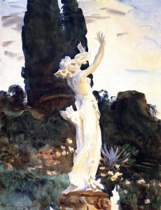
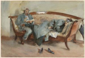


